Oliver Wainwright Guardian
In the depths of the emotional underworld at Ground Zero, an eerie place of crushed fire engines on plinths and dramatically lit scorched steel columns, is a fascinating site of architectural archaeology.
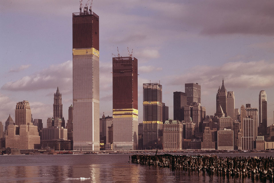
The twin towers of New York’s original World Trade Center under construction, as seen from Jersey City in 1970. Photograph: Ed Ford/AP
Marching in a mute line around the exhibition halls of the 9/11 Memorial Museum stand the original foundation pads of New York’s iconic “twin towers”, their rusted steel plates still bolted firmly into the Manhattan bedrock. Across the hall, a grid of massive steel bolts emerges from the 20-metre-high slurry wall, the vast concrete barrier that was cast to keep out the waters of the Hudson River and which held firm when the towers collapsed on 11 September 2001, stopping the subway tunnels beneath from flooding.
Along with a few charred columns which loom like devil’s forks above the entrance to the museum, this is all that exists of the original World Trade Center. But perhaps even more so in their absence, the twin towers remain one of the most powerful symbols of New York City.
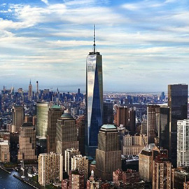
Where the ungainly obelisk of SOM’s One World Trade Center now stands, surrounded by a motley collection of stubby slabs, once rose the two sleekest symbols of America’s unbridled capitalist ambition and technical prowess; the identical twin kings of global finance, dressed in matching silver pinstripe suits.
Designed by Japanese-American architect Minoru Yamasaki, they were the tallest towers in the world when they were completed in 1974, standing as glistening beacons of structural innovation. They employed a radical framed tube structure to carry the load in their facades – thereby doing away with the need for columns inside, freeing up the interior for more office space (and requiring as little as half the material needed for conventional steel-framed construction).
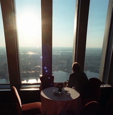
The towers’ windows were so narrow partly because Minoru Yamasaki was afraid of heights. Photograph: Chris Kasson/AP
The elevator system was revolutionary, too. Buildings so tall didn’t usually make much economic sense, given the amount of space that had to be given over to lift shafts at the lower floors, the taller you went. So the engineers devised a plan to divide each building into thirds, with elevator “sky lobbies” where people would transfer to local lifts to reach their required floors. The system saved 70% of the space that would have been used in a traditional lift shaft.
None of these innovations, however, turned out to be of much use when the buildings first opened – given that, at the time, there was precious little demand for such office space in Lower Manhattan at all. The Port Authority of New York and New Jersey – which developed the buildings at the behest of Chase Manhattan Bank’s chairman David Rockefeller – filled much of the north tower with its own offices, while the State of New York ended up occupying 50 floors of the south tower to stop the embarrassment of it standing empty.
Nor was the project received with much warmth by contemporary critics. Lewis Mumford compared the towers to a gigantic pair of filing cabinets, while others said they looked like the boxes that the Empire State Building and the Chrysler Building came in. Broadcasters raised concerns that the towers would interfere with television reception, while the bird lobby even protested that the buildings posed a grave hazard to migrating fowl.
The architectural community had hesitations about Yamasaki, too, many seeing his soft-edged modernism as too mannered and prissy. “He has developed a curiously unsettled style,” wrote New York Times critic Ada Louise Huxtable, “which involves decorative traceries of exotic extraction applied over structure or worked into it. His choice of delicate detail on massive construction as a means of reconciling modern structural scale to the human scale of the viewer is often more disturbing than reassuring”.
Huxtable took particular offence to the way his soaring metal columns branched into two to form gothic arches at the base of the towers: “Here we have the world’s daintiest architecture for the world’s biggest buildings,” she concluded.
Those who worked inside the towers didn’t really take to them either, with many complaining about the narrow windows. Often attributed to the need for all those densely packed structural tubes of steel, their narrow width was also partly down to the fact that Yamasaki himself was afraid of heights, so didn’t like expansive panoramic windows at such altitude. He preferred the psychological sense of security provided by windows that were narrower than his own shoulder span, so he reduced their width even further than the structure demanded. Frustrating for the occupant, perhaps, but from the street, such narrow spacing of these great columns gave the towers the striking appearance of seamless blocks of solid metal.

The downtown Manhattan skyline, shown here from Liberty State Park in 1998, was utterly dominated by the twin towers. Photograph: Joseph Sohm/Visions of America/Corbis
The objections of New Yorkers to the imposition of these gleaming twin totems were not just aesthetic. Having first been commissioned in 1962, by the time the complex opened, the tide had long since turned against the top-down approach of razing existing streets to build towers perched atop barren podiums.
The 16-acre site where the World Trade Center was built had been a densely packed area of existing industries, small businesses and more than 100 residents known as Radio Row, of the kind that urban activist Jane Jacobs fought so passionately to save. Radio Row was bought up under eminent domain, residents were evicted, and the 14 irregular street blocks swept away to make way for Yamasaki’s abstract superblock. There, retail was hidden away in the depths of the podium, so as not to interfere with the clean white tabletop above – which became a plaza so windswept that it sometimes necessitated the use of ropes to cross it safely.
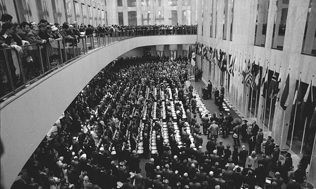
Dedication ceremonies attract a standing-room-only crowd to the World Trade Center. Photograph: NY Daily News via Getty Images
In his book, The Pentagon of Power, published in 1970, Mumford raged that the project stood as an “example of the purposeless giantism and techno-logical exhibitionism that are now eviscerating the living tissue of every great city”. Indeed, by the time it was completed, the whole endeavour seemed decidedly rearguard. With the rise of the Landmarks Preservation Commission, Radio Row might well have qualified as one of New York’s historic districts, along with Greenwich Village, Soho and Brooklyn Heights. It is telling that, less than a decade later, Battery Park City (a development built on reclaimed land, using rubble from the World Trade Center excavations) made much of the fact that it would have “traditional” blocks and street frontages, like the rest of the city.
Since the entire complex was destroyed by the events of 9/11, the hated podium may have gone – but what has taken its place can scarcely be said to offer a much better example of urban design. The two waterfall voids, marking the footprints of the towers, may provide a spectacularly powerful memorial, but they are surrounded by the clumsy debris of security sheds, ventilation shafts and a gargantuan concrete bunker for screening vehicles.
Along with the 60-metre-high concrete base of what was once called the “Freedom Tower”, Yamasaki’s minimalist hymn has been replaced by a compromised landscape, representative less of freedom than political compromise and paranoia.
