By David W. Dunlap New York Times
The new World Trade Center symbol, seen on Wednesday on Vesey and Church Streets, was designed by Landor Associates. Credit Chester Higgins Jr./The New York Times
Can you see a trident — an abstract trident recalling those three-fingered steel columns at the base of the twin towers, still standing after the 2001 attack, symbolizing New York City’s resilience?
It is there, in the World Trade Center’s new logo, which was revealed on Wednesday when the latest display panels were installed along a construction fence on Vesey Street.
Do you discern two parallel spaces in the upper half of the logo? They are intended to evoke the memorial beacons of the Tribute in Light. And the two bars on the lower half of the logo? The deep pools of the National September 11 Memorial.
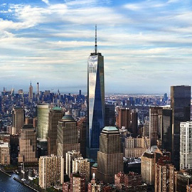
Look again, and the five bars might be taken for five towers: 7 World Trade Center, long finished and open; 1 and 4 World Trade Center, nearing completion; 3 World Trade Center, under construction; and 2 World Trade Center, still on the drawing board.
And yes, now that you mention it, the whole thing is a stylized W — for World Trade Center, of course, but also for Westfield World Trade Center, the name of the luxury shopping center that is to open there next year. (You are excused if you missed the fact that the slope across the upper bars is at a 17.76-degree angle, reflecting the height of 1 World Trade Center.)
“The logo acts as an icon for the whole physical space of the 16 acres,” said Erica Dumas, a spokeswoman for the Port Authority of New York and New Jersey, which owns the trade center site.
The new emblem includes the words “World Trade Center” set in the Helvetica Ultra Compressed typeface. It will not replace the logos of individual occupants of the trade center site, but is supposed to lend a graphic unity to way-finding signs, building entrances, digital directories, kiosks, uniforms, websites, apps and marketing materials.
Landor Associates, a corporate identity firm whose best known creation may be the FedEx brand, was awarded a $3.57 million contract by the authority board in 2013.
Before September 11, 2001, the trade center’s logo featured the pinstriped twin towers popping out of what almost looked like a Taiji symbol. An impromptu interim emblem was devised by superimposing a billowing American flag on the twin towers.
Landor faced a challenge in devising a trademark that would be acceptable to all of the site’s occupants, pay homage to a tragic past and create a hopeful image for the future.
“It’s an impossible task,” said James Biber, a principal at Biber Architects. He works in the nearby Woolworth Building and paused on Vesey Street to inspect the new logo. “It’s so anonymous that it almost evaporates.”
“Maybe this is the last step in the rebranding of something that has disappeared,” he added.
Douglas Riccardi, the principal in the design firm Memo, was with Mr. Biber. He seemed more forgiving of the complex design. “Its strength is its ability to be seen in many ways,” he said. “You could never get more meaning in five little bars. The problem is that people may not bother to find out what the meanings are.”